Case Study
Incentivos
Redesigning Bigbox’s rewards platform. Participated as a member of the UX/UI team.
Some of the tools used for this project


Context
Biglife is a platform developed by Bigbox that offers to raise the benefits and incentives of its corporate clients to a Premium level. It consists of a platform through which collaborators can obtain points thanks to their performance and exchange them for Bigbox gastronomic, entertainment, wellness, or adventure experiences.
Why redesign Biglife? The product had not seen any iterations since its launch and there were problems with its navigation, architecture, and an outdated interface that did not respect modern design patterns. The business unit entrusted us with the task of redesigning the site and updating it with the Bigbox design system, as well as giving the product a new identity aligned with the business needs.
My role
I got assigned as responsible for this project. My job was to redesign the whole site, hand off the design system to developers, and present changes to the product team. I started sketching by hand and eventually defined Biglife's new visual identity.
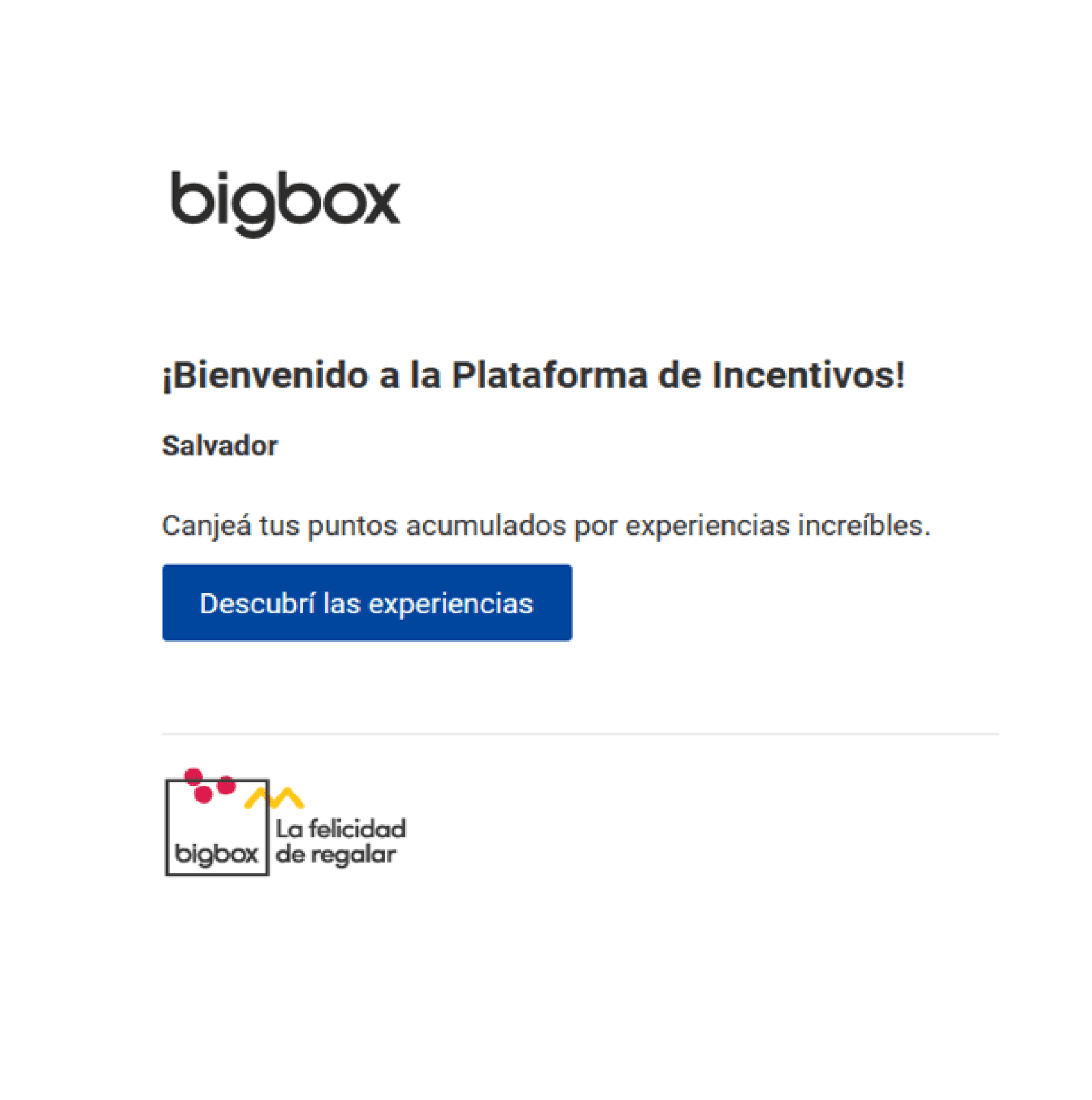
For color, we decided to remove the blue and change it to orange to convey a feeling of warmth and joy. Business Unit implemented the possibility of customizing the site for corporate clients by adding their logo and that is why I decided not to include the Bigbox category colors (yellow, lilac, cyan, red, blue) so it would be easier to combine the brand styles from corporate partners.
Screenshots of Biglife’s old sign-up confirmation email with the previous logo and color palette / Example of a partner’s logo applied to the website.

#FF6C5E / #FF7A6E / #FF897E / #FF988E
#464646 / #4A4A4A / #828282 / #BDBDBD
#FEFEFE
Color
Icons
Spacing
12
16
20
24
32
40
48
56
64
Our base grid is 8x8px. Designing on this grid allows us to quickly define sizes and distances effectively.
Typography


My role
We enabled the use of horizontal scrolling.
Now it is possible to highlight special discounts from our corporate partners.
We created a “How it works” section so users could experience an easier learning curve.
We updated the filter by adding new categories for experiences available within the catalog.

The activity view section was redesigned, optimizing space and showing the rules and conditions of the reservation.
We added the My points and My transactions sections so collaborators can keep a record of their transactions and the reasons behind the points assigned.

From now on is possible to buy points with local currency.
We modified the purchase summary section to make it easier to recheck the information.
We emphasized success or failure alerts.

We added a Favorites feature, so users can save the experiences they’re interested in.
We implemented blank states and error screens to keep users informed and encourage them to take actions such as buying points or exchanging their first experience.

Web version of Biglife
I redesigned mailings according to the new design system:


Customer support
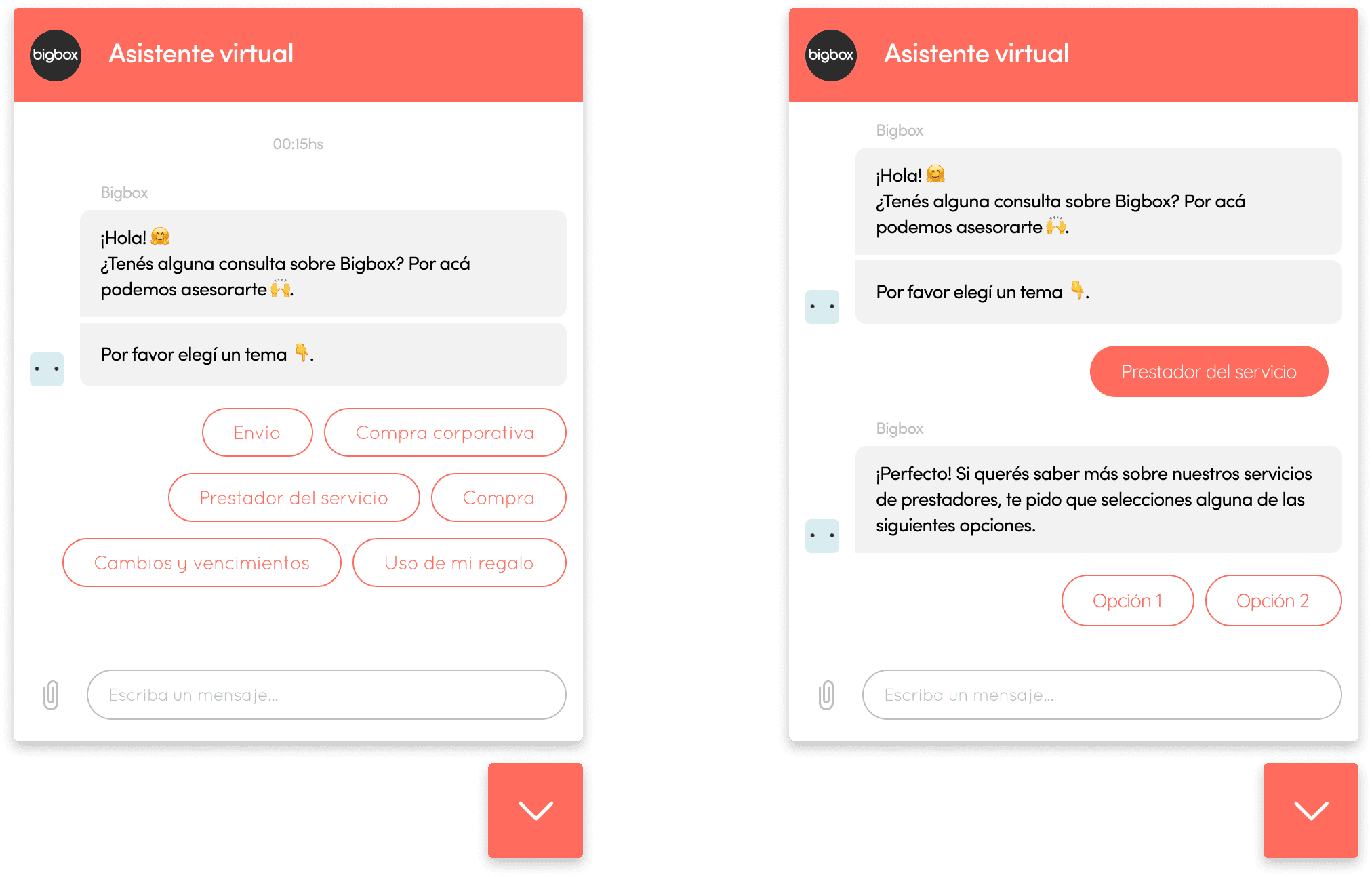
Due to the number of questions received by email, alongside the Customer Service team, we integrated Zendesk as our virtual chat assistant to reduce inquiries and response time, improving service.
Projects

Bullmetrix
Redesigning Bullmetrix website
Prototyping
UX/UI
Architecture
UI
Redesign
Design system
Marketing
See project
CXO4: Branding & Identity
Branding to scale customer’s business to the next level
Design
UI
Branding
Brand Book
Workshop
Logo
Graphic Design
Brand Guidelines
See project

Dead Person’s Switch
An economic protection plan for your and your loved ones.
Cryptocurrencies
Finances
Research
UX/UI
Diagramming
Prototyping
Testing
Personas
Surveys
Interviews
See project

Biglife by Bigbox
Redesigning Bigbox’s rewards platform.
Corporate
Prototyping
UX/UI
CMS
Mailing
Redesign
Design system
See project
Let’s keep in touch
Feel free to connect with me on linkedin, or email me at salvadormartinezux@gmail.com
© 2023 Salvador Nehuen Martinez. All rights reserved.